The Social Tracker Overview Report gives you a look at the overall performance of all the social profiles in your campaign. At the top are your controls to select the company and date range to focus on:
Select Company

By default, the tool will have your main company in the company selector, and the date range set to the past 28 days. You can change these settings with the Company drop-down and the calendar at the top of the reports in this tool. The Company selector in the Overview will let you pick a single company to focus on.
If you open a deeper report, like Facebook Posts, you are able to select “All profiles” to compare data from all of the companies in your campaign.

Setting the Date Range

Adjusting the date range with the calendar will customize the time range for data in all of the reports in the tool. For example, if you want to analyze activity on a single day from the beginning of your campaign, open the calendar and select the specific day. Or, if you want to see activity over a four-month period, enter the first and last date of the custom period in the calendar dropdown.
Historical Data in Social Tracker
When you first set up tracking in this tool, you can view posts and engagement data dating back sixty days before the date that your campaign began*. However, we cannot collect historical data on the size of a social media profile’s audience. So if you created a new Social Tracker campaign on August 31st of 2024, you would be able to see data from July 1st, 2024.
If you have an instance where this is not the case, please reach out to our support team.
*Our historical data goes back sixty days for all of our platforms except for YouTube. Due to YouTubes API restrictions, we are only able to look back to the past 30 days*
Social Channels
The top of the Overview will show the select company’s audience size, activity (posting activity), and engagement on each channel. You can sort this graph with the column headers; Audience, Activity, and Engagement. This is an easy way to see where a company has the biggest audience, where they post most frequently, and where they see the most engagement.
After you select the timeframe that you want to analyze, Semrush will put a green or red arrow next to a metric that increased or decreased since the previous period. If you select a 7-day period, the metrics will be compared to the total from the week before your time frame. If you select a single day, the metrics will be compared to the day before your selection.

Top Content
The Top Content section shows your competition’s most engaging posts over the given time frame. You’ll see the top posts on Facebook, Instagram, and Pinterest based on engagement. The posts can be sorted by Total Engagement or Engagement Rate. Total Engagement will tell you which post had the biggest overall impact, and Engagement Rate will tell you which post had the biggest impact relative to the size of their audience.
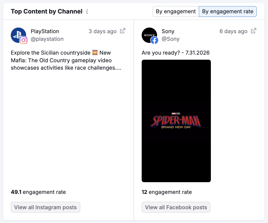
From here you can identify which competitor gets the most audience interaction and gather ideas for what to talk about on your own channel. Click on “view all __ posts” to open a Posts report for the corresponding channel. In a Posts report, you can see all of the posts that your competitors published over the select time frame.
Comparison with Competitors
This graph compares you and your competitors on three basic metrics; audience, activity, and engagement. By default, it sorts by Total Audience size, but there are multiple ways to manipulate the graph.
Change between comparing audience, activity, or engagement with the titles on the left (1). Then choose to sort by the total number, change in this number, or growth % (2).
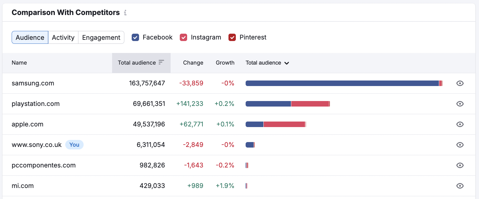
You can add or remove social networks from the table by checking or unchecking the boxes above it. This allows you to get specific analysis on a single social network or any combination of networks together.
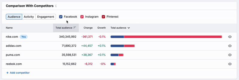
You can also customize the graph by hiding the metrics for a single company with the eye icons on the right side of the graph.