The Social Tracker Facebook report gives you a handful of ways to compare the success of your Facebook page to your competition.
Settings and Navigation
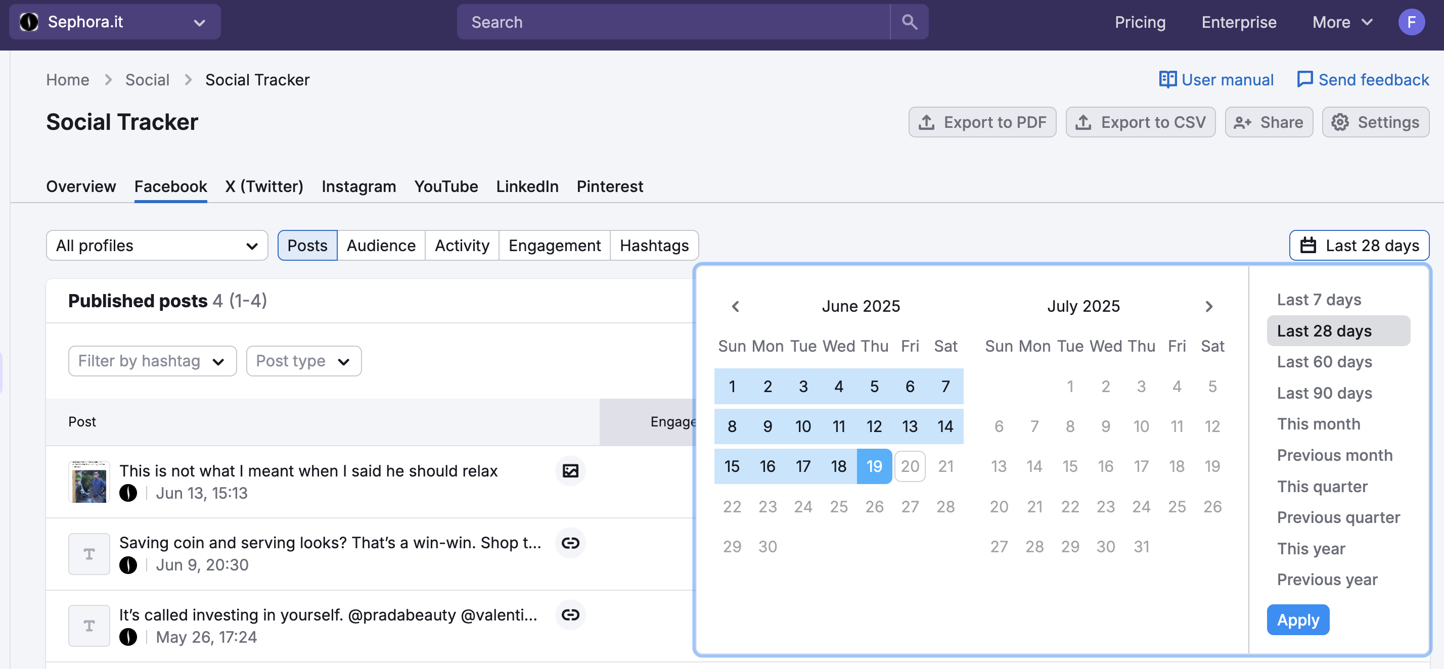
Navigate between these subsections with the subheaders under the Facebook tab. All of the data in the report is based on the company you select in the Company selector and date range set in the calendar. By default, these will be your main company and the last 28 days. Change these settings with the drop-down menus above the report.
The Facebook report in the Social Tracker is broken into five subsections: Posts, Audience, Activity, Engagement, and Hashtags.
Posts
In the first section, Posts, you can browse through the complete list of a competitor’s recent Facebook posts. The date range dictates where we source the posts from, and the Company dropdown above the table allows you to look at your company, one of your competitors, or all profiles in your folder (1).
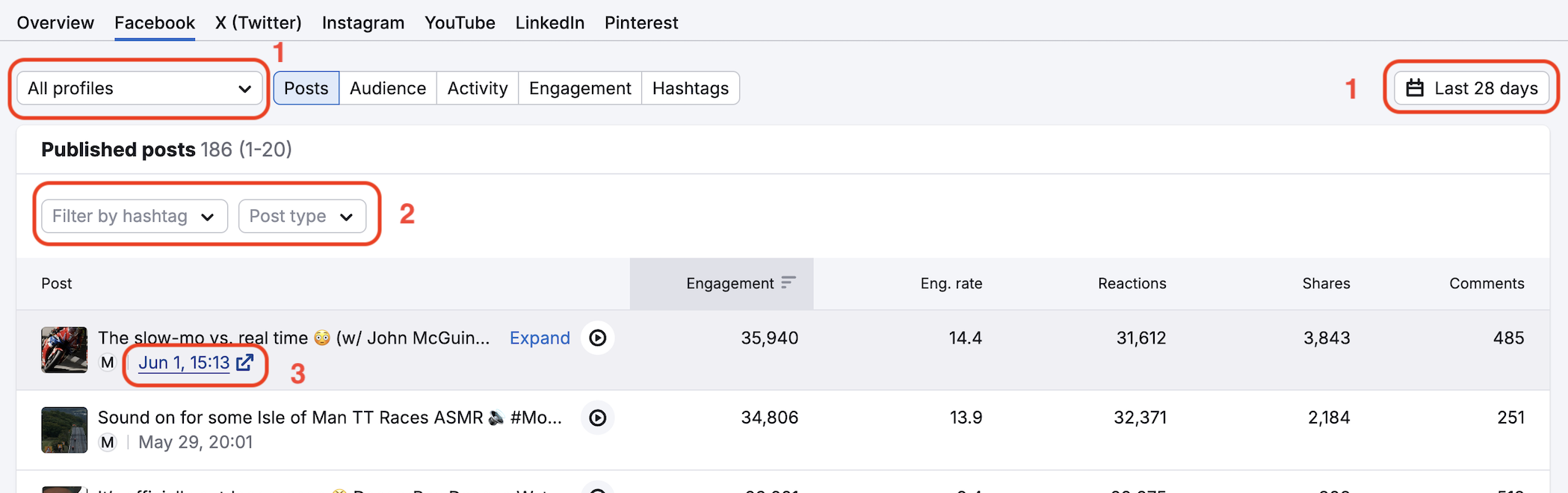
You can choose to view all types of posts, just links, just photos, or just videos with the “Post types” selector. You can also enter or choose a hashtag from the drop-down to filter posts that include a specific hashtag (2).
By default, the table will sort the posts by Total Engagement. Total Engagement in the Facebook report is the sum of all likes, shares, and comments on a post. However, the posts can be sorted by any of the column headers (post date, total engagement, engagement rate, number of reactions, shares, or comments).
If you want to see the actual post as it appeared on Facebook, click the blue arrow next to the name of the company (3).
Audience
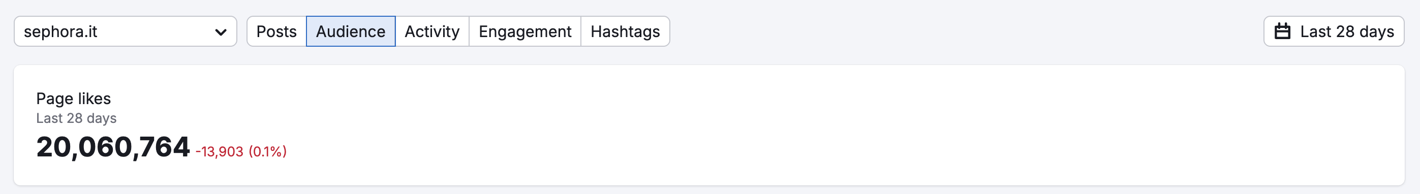
The Audience subsection under Facebook provides a deeper look at the company’s Facebook audience. At the top, you can see a summary of total page likes, compared to company’s number of likes in the chosen date range. The amount of audience change and growth % over that time are also shown.
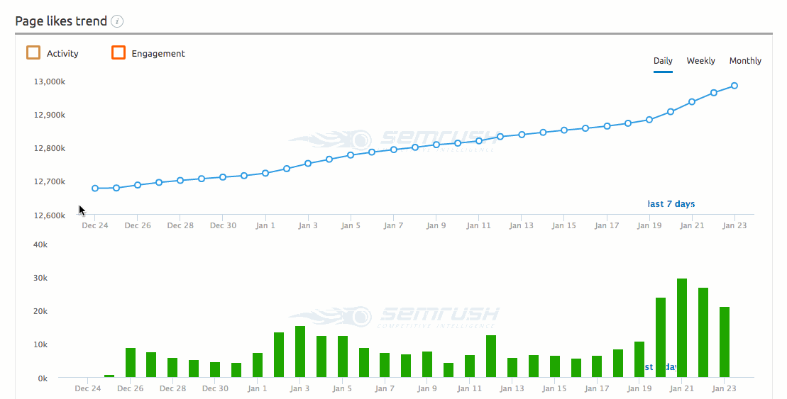
Page Likes Trend
Then there is the Page likes trend chart, showing you the daily, weekly, and monthly trend of page likes that the company acquired over time. The blue line graph indicates the overall page likes number and the green bar graph indicates how many new likes came from each day.
Comparison Graphs
At the bottom of the Audience section are two graphs: Page likes trend and Total page likes compared to competitors. The first graph (line graph) compares each company’s trend of page likes.
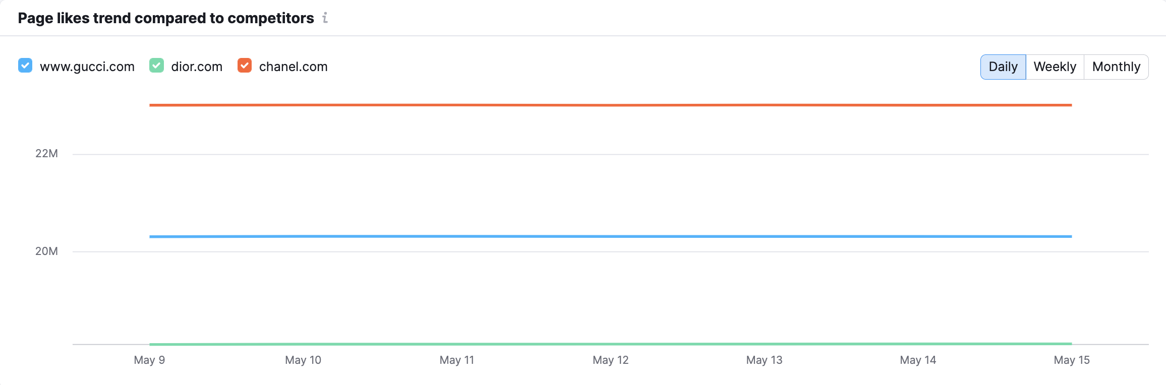
The second graph (bar graph) compares the total page likes between the competitors.
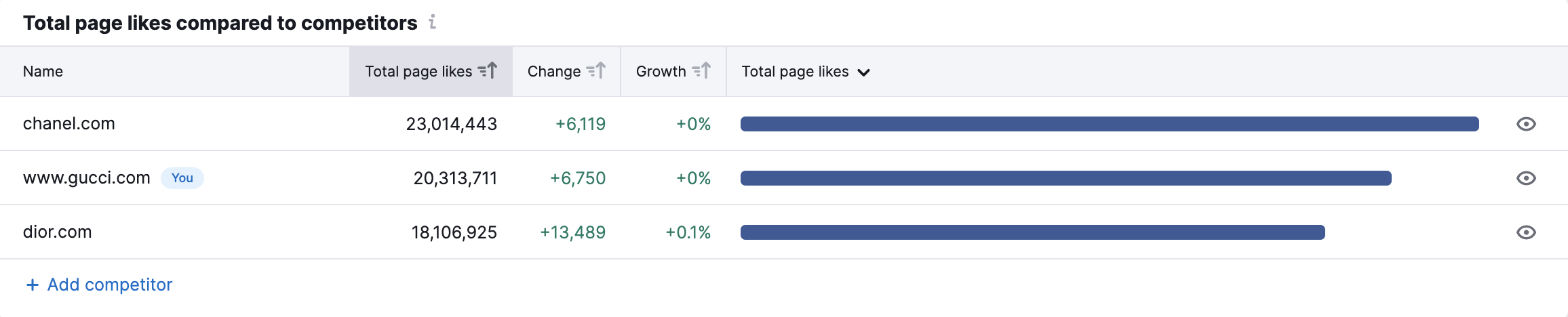
You can hide companies from the graphs to see a closer comparison between any two competitors.
Activity
The Activity tab gives you all kinds of information about the company’s posting habits and trends.
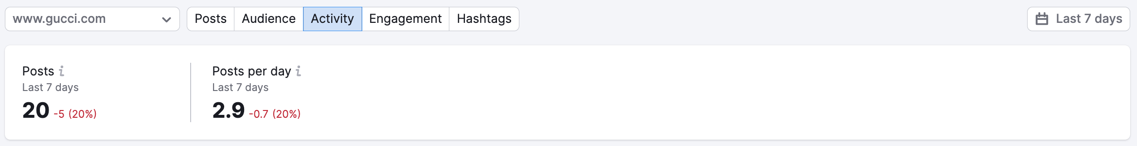
Top section
The top details how many total posts the company published in the select time frame. This metric is broken into posts per day showing how many posts were published per day averaged over the selected time period.
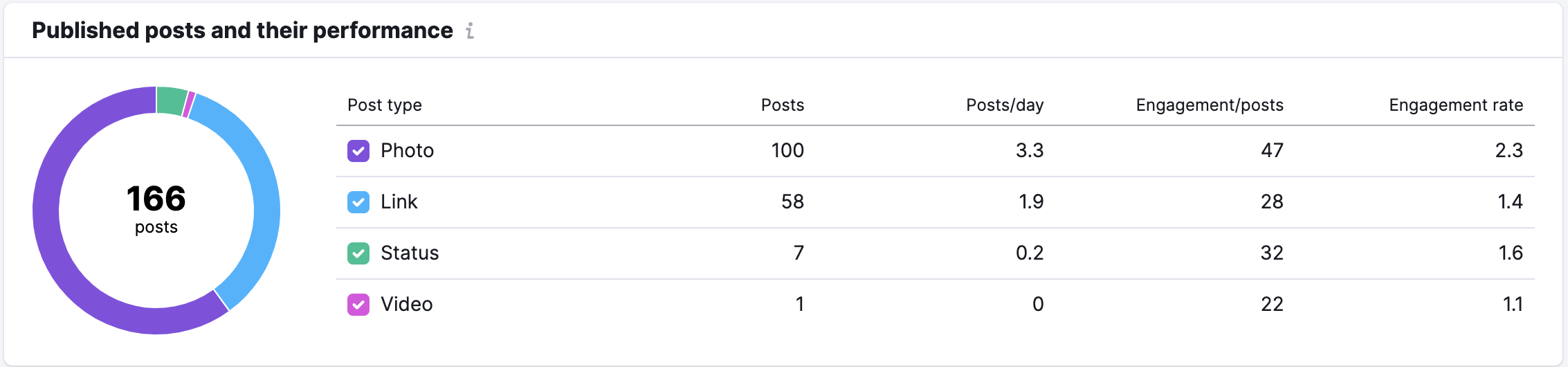
Published posts and their performance
The second section shows you how different types of posts (links, photos, statuses, videos, etc) engage a company’s audience differently.
All the post types are broken down into 4 categories—photo (posts containing photos), link (posts that include any type of links), status (text posts), and video (posts with videos).
The circle chart lists the total number of posts by the page and the table breaks down how many of each type were posted per day, on average, and how much engagement each type of post gets. For example, you could study a competitor and discover that videos engage their audience far more than any other type of media. Then, you could take that information and plan to include more videos in your Facebook marketing.
When posts are published and people engage with content
Next, you can see a time-based analysis of their posts and engagement. These two graphs show the times of the day and week the company publishes and the times of the day and week the company’s audience engages with their posts.
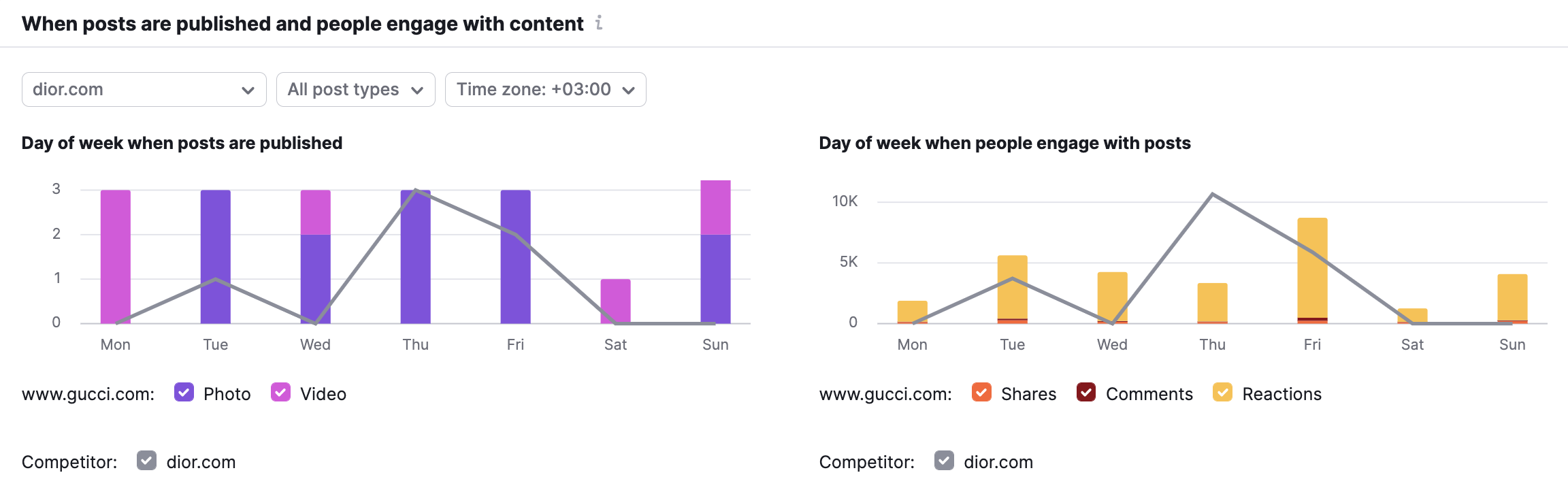
You can use these graphs to identify when your audience engages with you the most, and compare that trend to when a competitor’s audience engages with them the most.
At the top of this section, you can select a single competitor and a specific day of the week to compare publishing and engagement numbers. You can also choose the post type that you want to compare. This lets you compare engagement habits for photos, links, statuses, and videos. For example, notice how the GIF below compares the Facebook activity of photos and videos posted by Gucci.
![]()
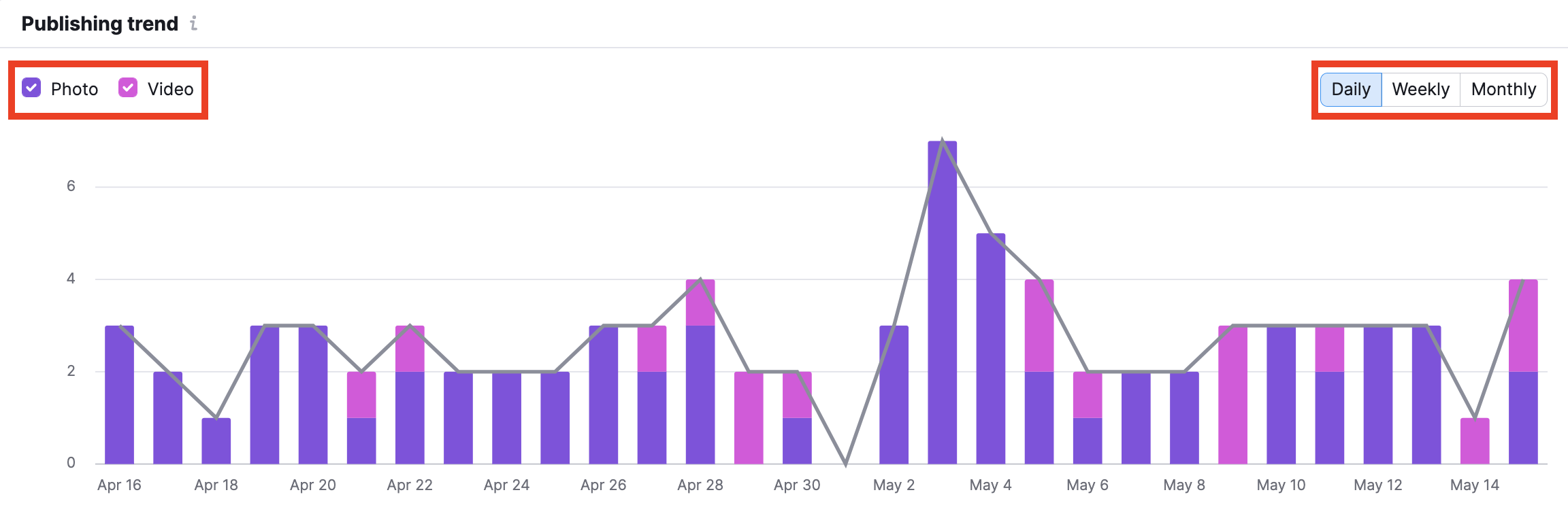
Publishing Trend
The next graph is the Publishing trend, or when the main company publishes their Facebook posts on a daily, weekly, and monthly basis. The posts are broken down into links, photos, and videos, all of which can be removed from the graph with the colored squares.
Comparison Graphs
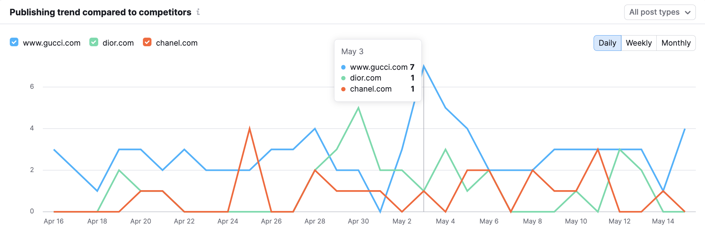
The last two sections of the activity report compare your company’s publishing trend and an overall number of posts to your competitors.
Engagement
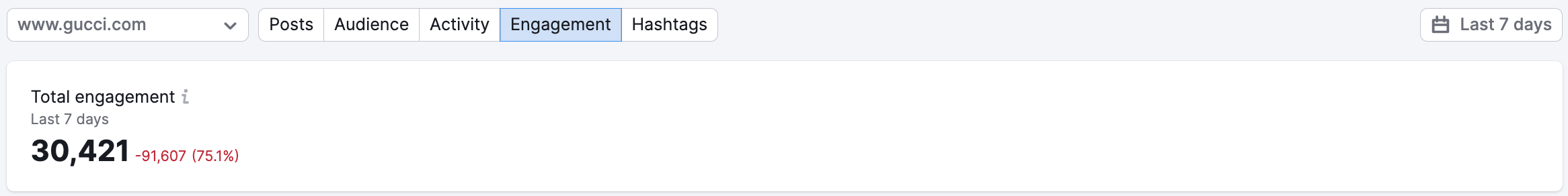
The next subsection allows you to see a company’s engagement summary. Total engagement on Facebook is measured as the sum of all shares, comments, and reactions (likes, wow’s, sad’s, angry’s, etc) on any of the profile’s Facebook posts over a given period of time.
The chosen company’s total engagement will be compared to the previous time period. So if your date range is set to the last 7 days, the engagement levels will be compared to the 7 days before that. It will be clear if the company’s engagement is increasing or decreasing because the change and growth numbers will be shown in green (for positive) and red (negative).
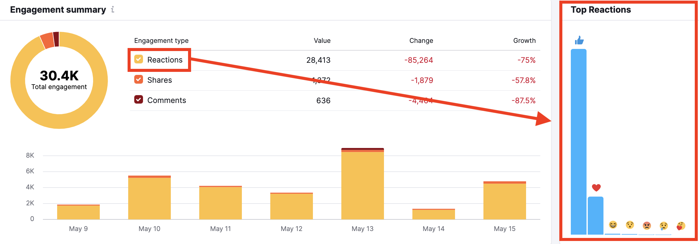
Engagement Summary
This section breaks down your total engagement number into reactions, shares, and comments. For each type of engagement, you’ll be able to see if the change and growth are positive or negative. To the bottom right of this area, you’ll see a bar graph displaying the spread of reactions that the page’s posts received.
Comparison Graphs
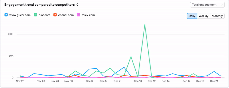
The bottom of this section has two graphs comparing all of the competitors in your campaign. The first is Engagement trend and the second is Total engagement.
The Engagement trend graph (below) shows how you and your competitors engaged your respective audiences over time. From here you can see any spikes or dips in engagement to find days when a company received an usually high or low amount of engagement.
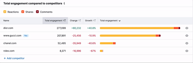
The Total engagement graph (below) compares the overall amount of engagement between all of the competitors over the given period of time. In this graph, you can deselect reactions, shares, or comments to hone in on comparing a specific type of engagement. This allows you to see which competitor received the most shares over a month, or which competitor got the most reactions on a specific day, for example.
Hashtags
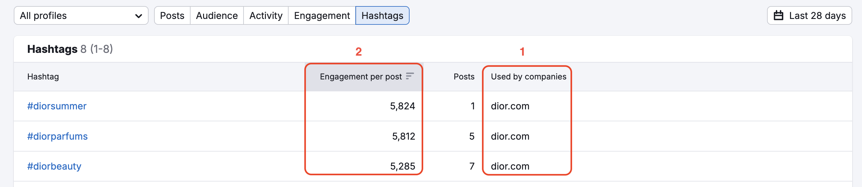
The hashtags subsection allows you to see the most engaging hashtags used by you and your competitors over the given time frame. You can see a number of companies that used each hashtag in the “Used by companies” column (1), and the total engagement per post with each hashtag in the next column (2).
If you click on a hashtag from the list, you’ll open a Posts subreport filtered by the hashtag so you can see all of your competitors’ posts using the hashtag.